Context
Originally scoped as a redesign using government-provided templates, which turned out to be incomplete. After the first discovery call, we agreed to pursue a full custom redesign instead — setting the tone for a project with a client who had strong opinions and gave consistent, detailed feedback throughout.
Two constraints shaped every decision: the site had to include the standard government links bar and stay visually consistent with other state agency sites, and accessibility was a foundational priority, not an afterthought.
Research & Discovery
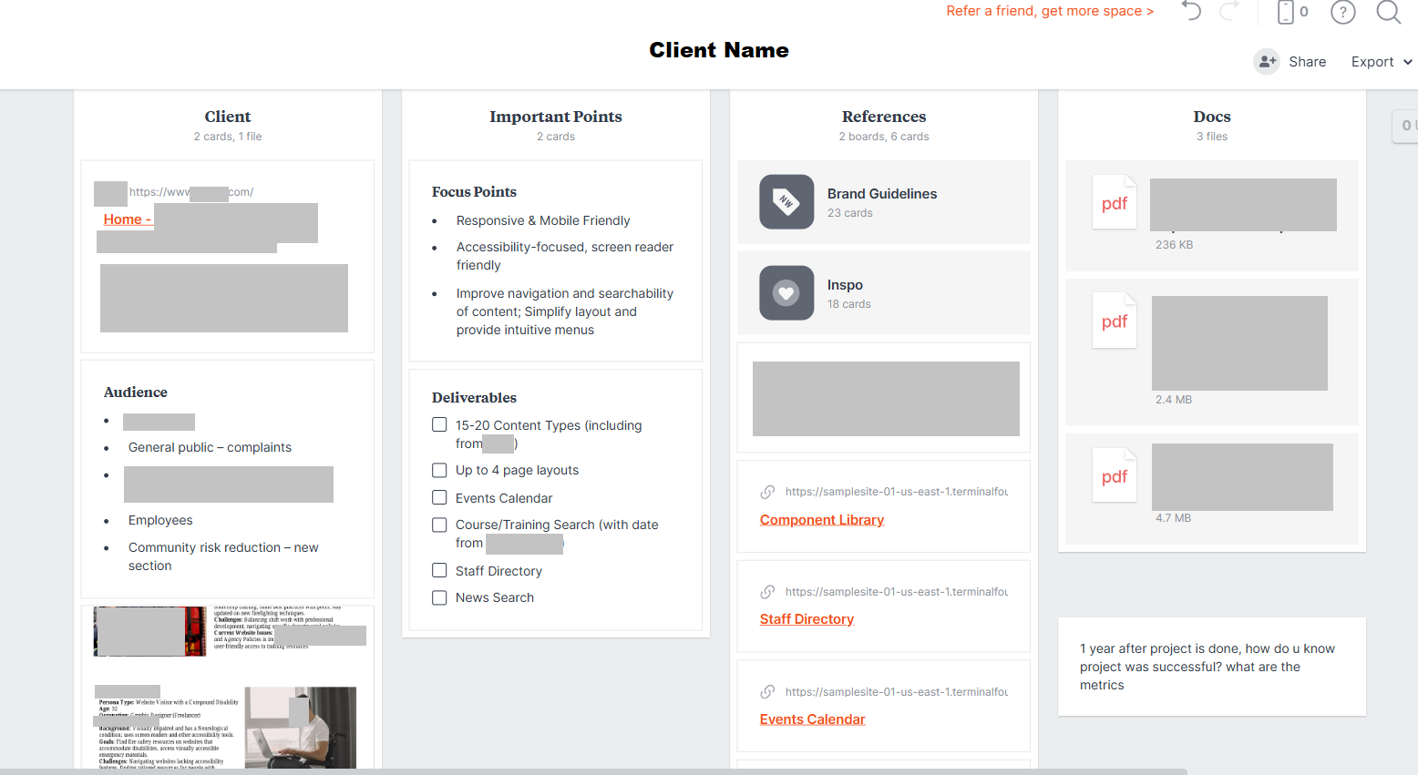
Before the discovery call, I gathered everything available about the client — brand guidelines, user stories, and background context — into a Milanote board, and prepared a set of questions to make the most of our time together.
The research phase included a 127-response user survey, a full content audit, an analytics review, and six discovery and alignment workshops with the client. The survey surfaced four recurring pain points: hard-to-find training classes, a buried platform login, outdated or hard-to-find forms, and a site that felt generic.
Initial assumptions suggested a broad user base; research narrowed it to three primary audiences. The client also provided eight detailed personas, including a visitor with compound disability, which kept accessibility grounded in real use cases rather than a compliance checklist.
Design Process
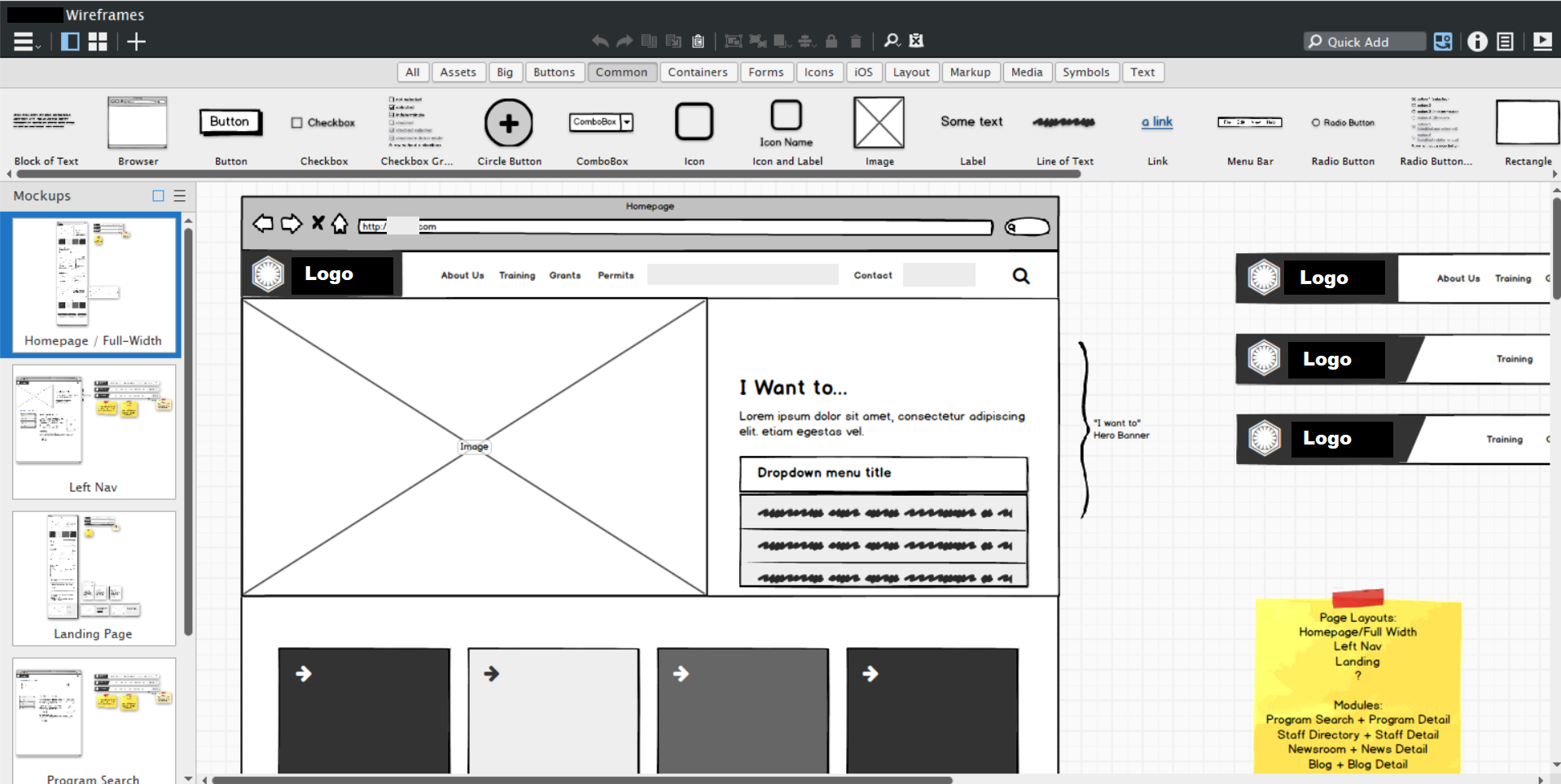
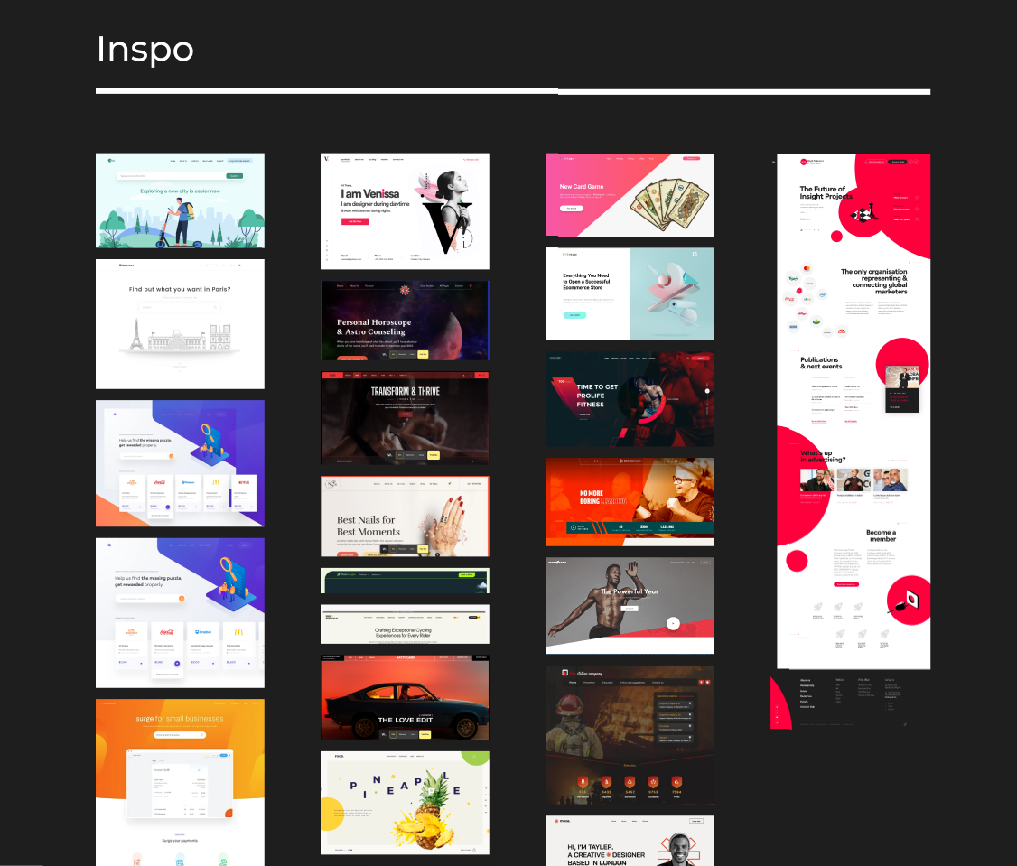
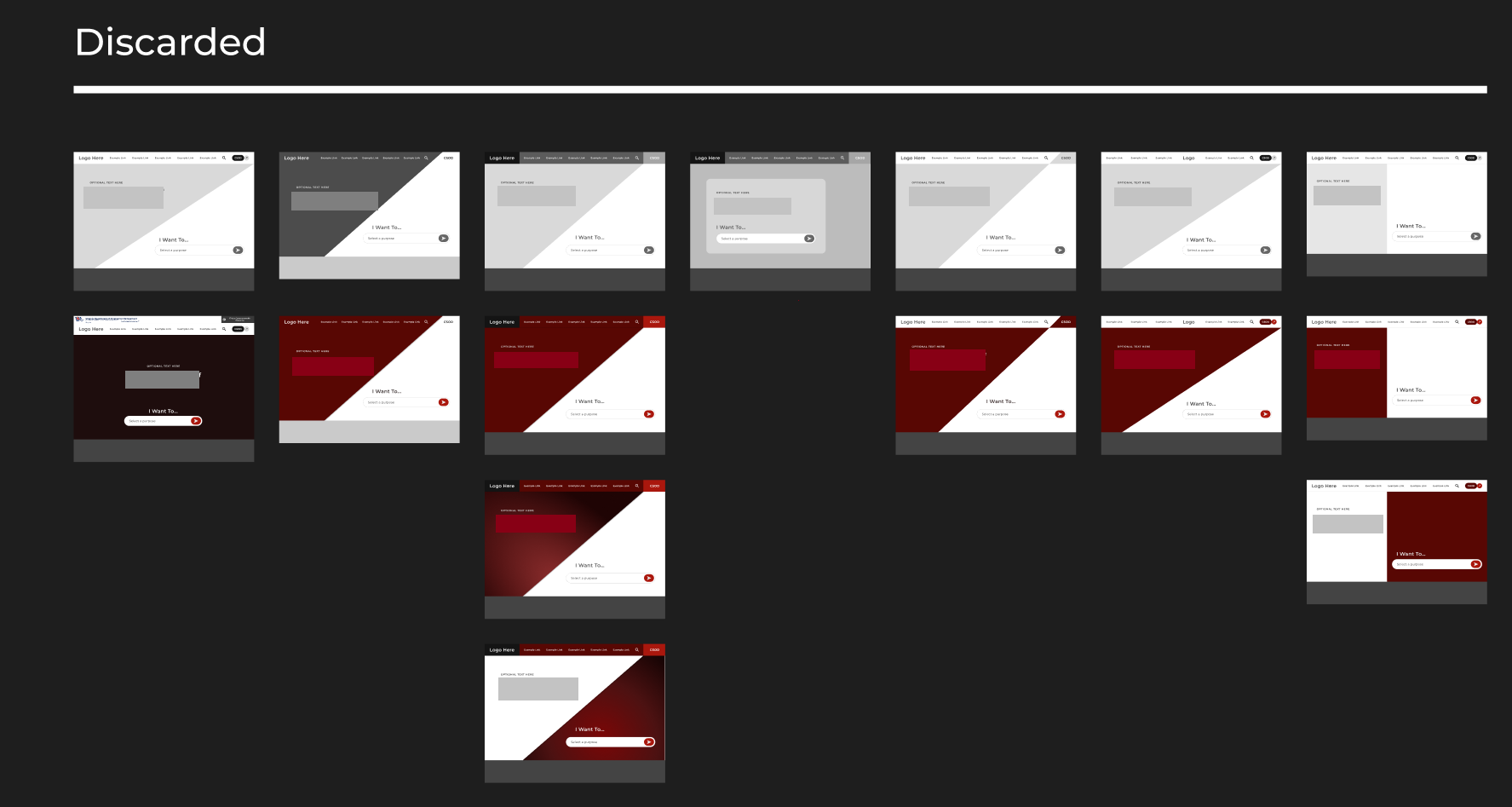
After wireframes were approved in Balsamiq, I moved into visual design. Rather than jumping to high-fidelity mockups, I presented a structured moodboard covering search bar styles, navigation patterns, and color accents, alongside multiple design directions.
This client wanted to be involved, so giving them range meant their feedback stayed specific and actionable throughout. One technique that consistently accelerated the process was working live during calls — making changes directly in Figma while screen-sharing.
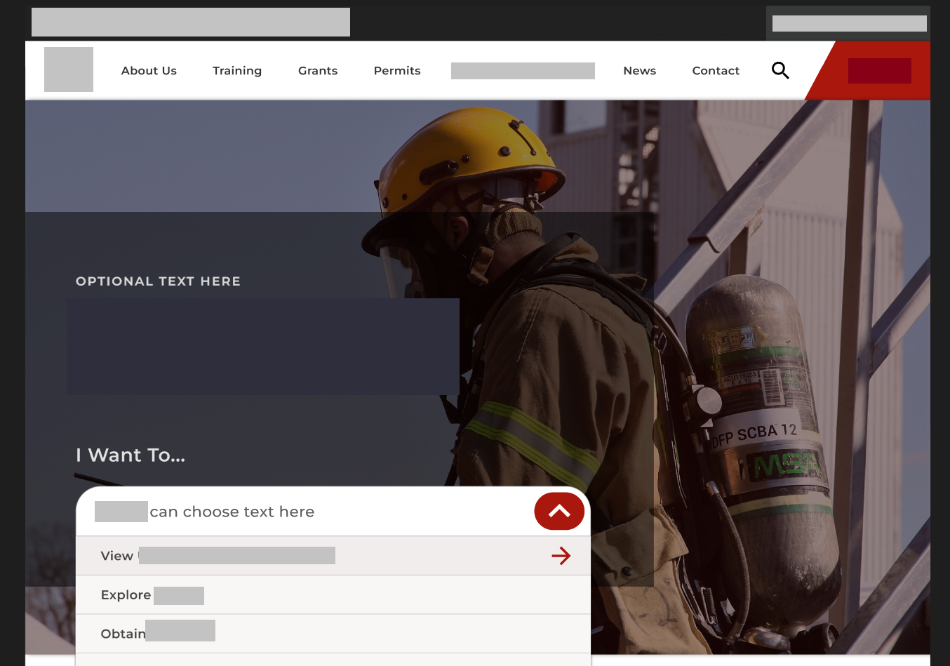
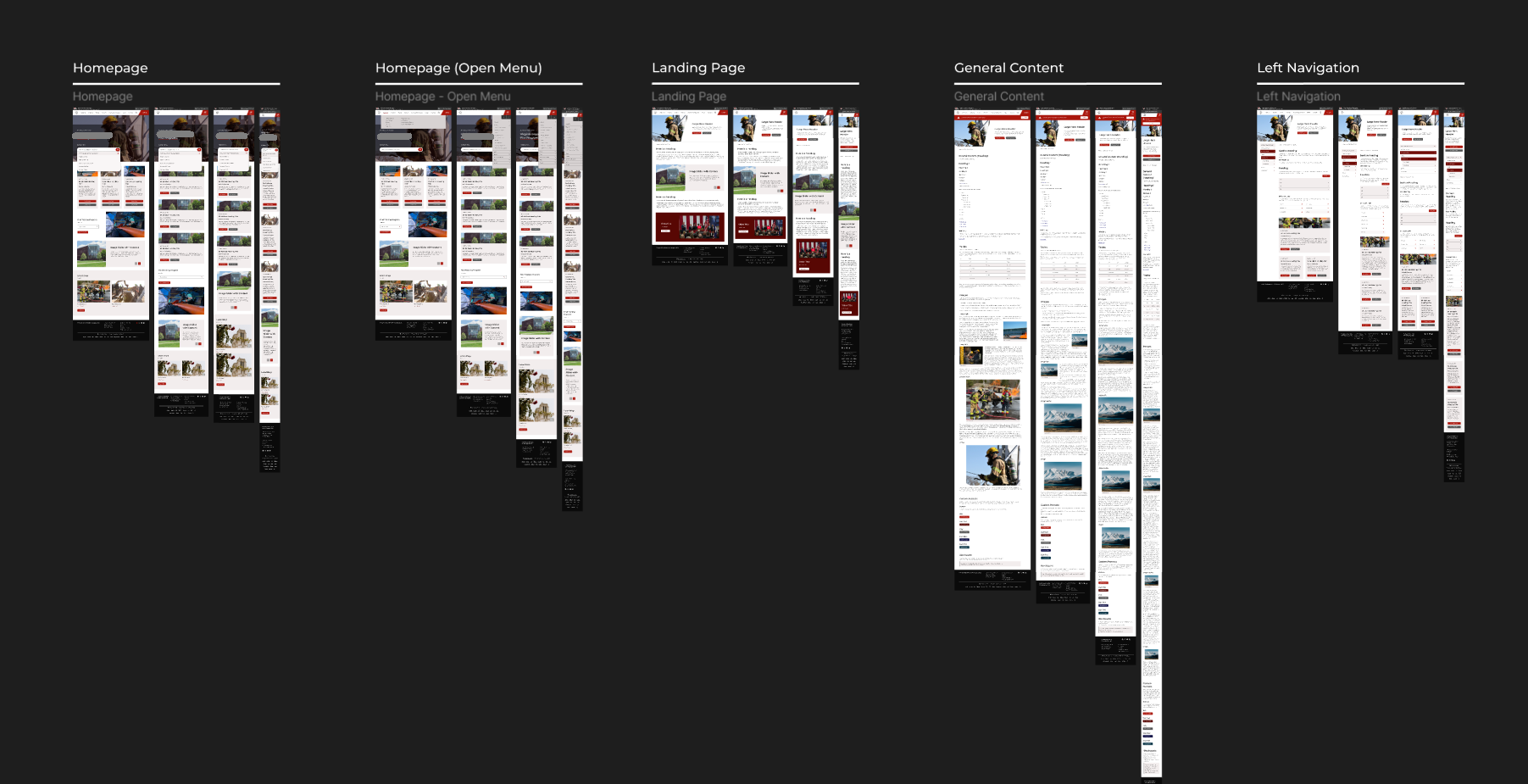
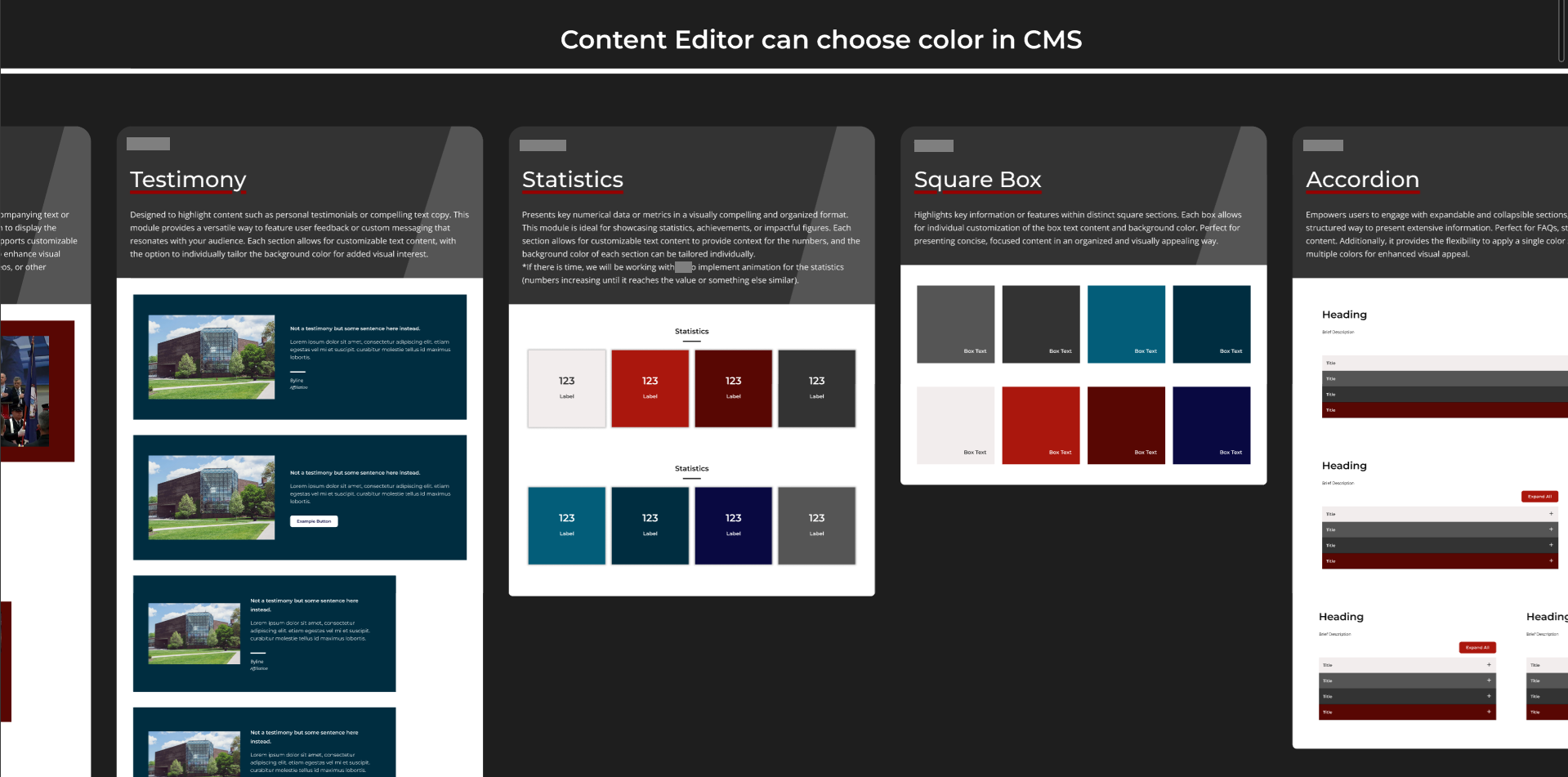
Key decisions: top-level navigation reduced from 9 items to 5 with a persistent search bar, a permanently visible platform login link, a card-based content layout, an 8-point grid with a reusable component system, and a mobile-first build validated against the survey's flagged usability issues.
Accessibility
Accessibility was a project priority from day one, driven both by the public-sector context and by the client's own user base. The personas provided by the client — particularly the visitor with compound disability — kept accessibility grounded in real use cases rather than treated as a compliance checklist.
In practice, this meant color contrast testing in Figma for WCAG compliance, keyboard navigation and focus state testing throughout the design process, and cross-browser and real-device testing before sign-off.
Digital Applications
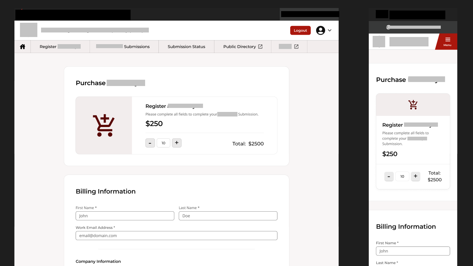
Beyond the website, two paper-based processes were fully digitized: a secure manufacturer portal for vendor self-registration and payments, and a public digital permitting application designed with less tech-savvy users in mind.
Both were designed and built with the handoff in mind — a client-facing style guide covering all content types and design decisions, and a developer handoff document detailing every component and its implementation.
Outcome
Both the redesigned website and the digital applications launched successfully and on time. After launch, the agency reported a noticeable reduction in phone and email enquiries about where to find things, and the two paper processes were fully replaced by digital forms.
Reflections
The moodboard session early in the process was one of the best decisions on this project. For a client this engaged, it compressed weeks of potential back-and-forth into a single focused conversation.
The one thing I'd do differently: I would have pushed for one or two rounds of independent testing with actual end users before final approval. All iterations were validated through client feedback, which worked well — but real user testing would have added a layer of confidence, particularly for the applications.