The challenge
The client was already hosted on the T4 CMS and needed a microsite for a students portal. The core challenge wasn't technical — it was clarity: the portal needed to feel distinct from the main university homepage so students could orient themselves, while still feeling like part of the same institution.
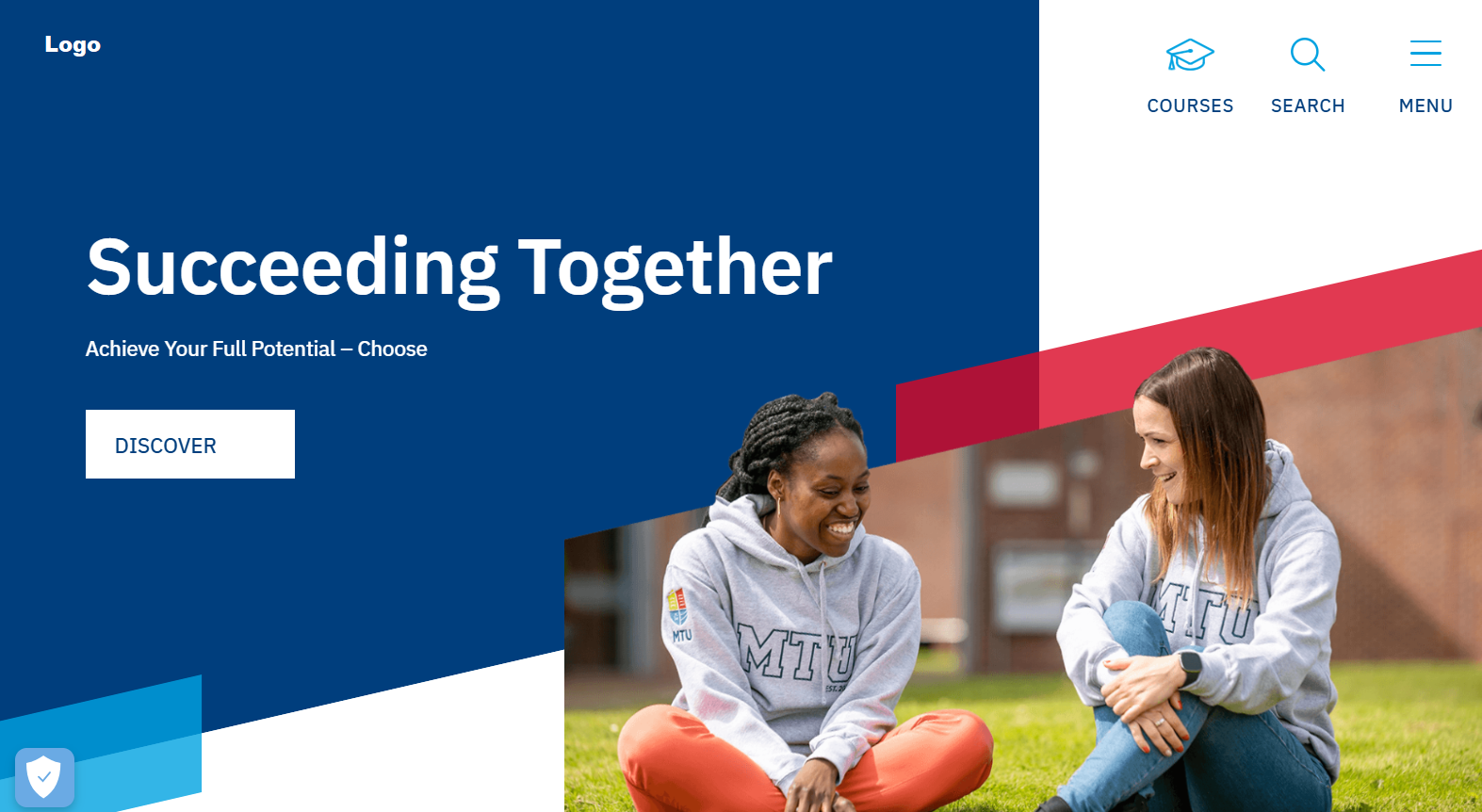
Understanding vague requirements through active listening
This client often worked through decisions mid-conversation rather than arriving with a clear brief. Rather than waiting for direction that never fully came, I listened closely to identify the underlying concerns beneath surface-level feedback and translated those into concrete design decisions.
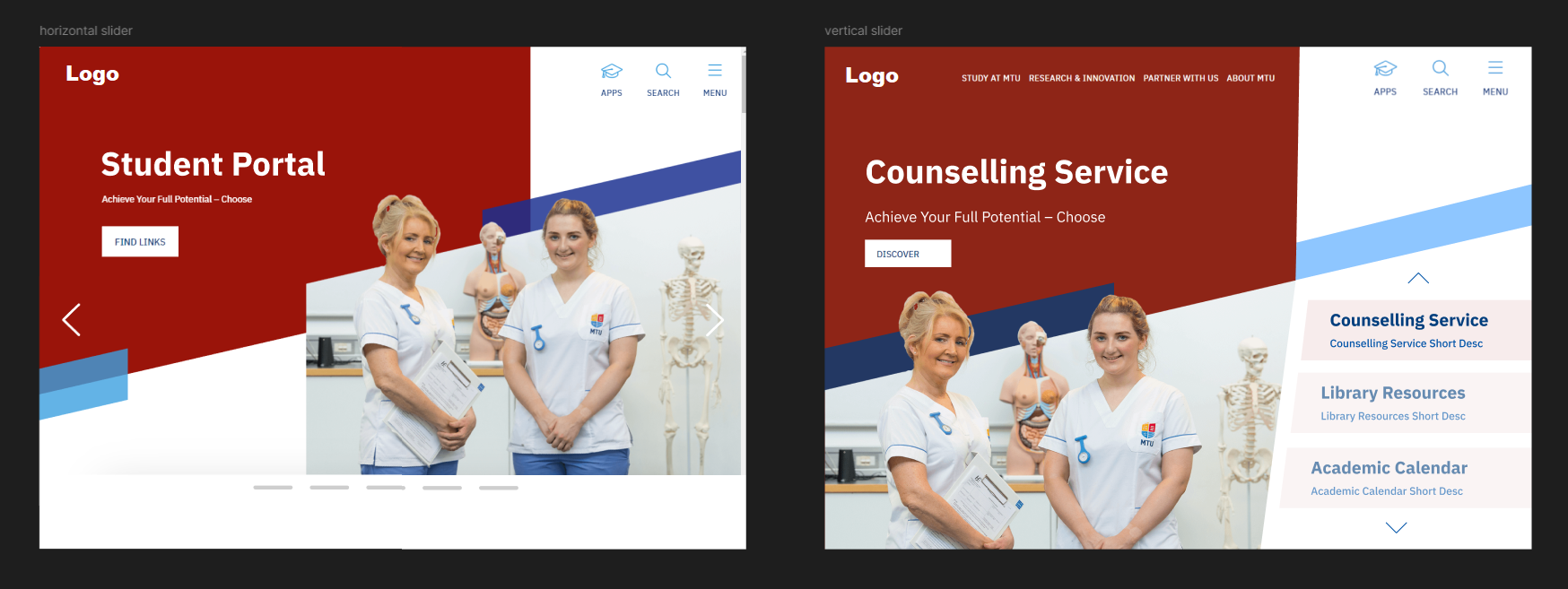
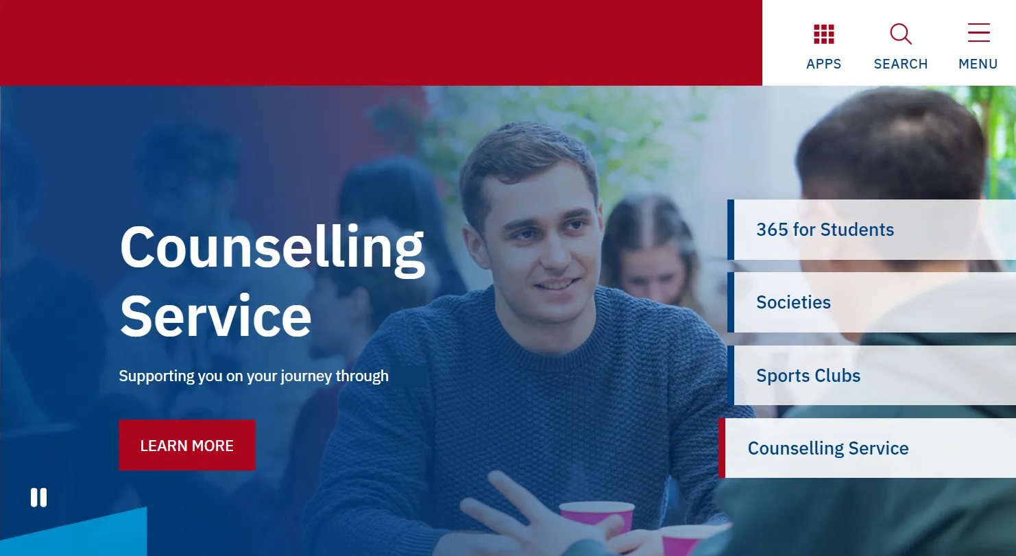
One example: the client wanted all department links to carry equal visual weight, for relational rather than aesthetic reasons — no department should feel deprioritised. That understanding led directly to a scrolling carousel where every link gets the same real estate, with a pause button included as an accessibility consideration.
Designing for distinction without disconnection
For the homepage banner — the main differentiator from the university's main site — I presented 3–4 initial directions inspired by online research and shaped by the brief they'd described. Offering multiple options gave the client genuine freedom of choice and compressed the revision cycle by surfacing preferences early.
Their feedback on the first round made it clear they wanted something more visually distinct than I'd initially interpreted, so I pushed the next iteration further. The final design landed well and was approved quickly.
Menu and navigation decisions
For the top navigation, I proposed switching from a vertical to a horizontal icon layout. The client responded positively and it was implemented as suggested.
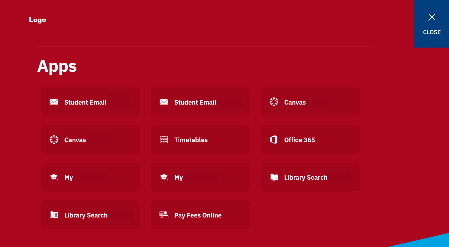
For the new apps menu — built from scratch to surface key student resources — I proposed a grid of equal-sized rectangles, each linking to a relevant section. This directly addressed the equal-priority requirement the client had raised earlier.
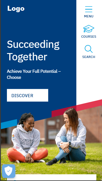
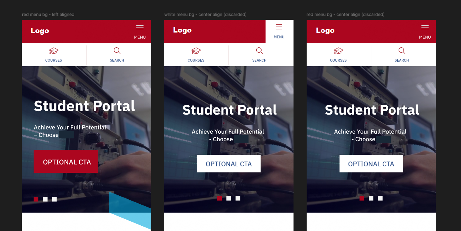
On mobile, I presented a few variations exploring small but meaningful differences: the color treatment of the top bar menu button, and whether the hero banner content should be left-aligned or centred. The structure remained consistent across all options.
Outcome
The project went live successfully. Despite a challenging collaboration process, the client was happy with the final result — an outcome I attribute to listening carefully and turning ambiguous conversations into actionable design direction.