This was originally scoped as a redesign using government-provided templates — which, when they arrived, turned out to be incomplete and insufficient for the project's needs. In the first discovery call, the client was deeply dissatisfied with them, so after internal discussion, we agreed to pursue a full Samplesite redesign instead. That shift set the tone for the whole project: a client with strong opinions, genuine investment in the outcome, and the willingness to give consistent, detailed feedback throughout.
Two constraints shaped the project from the start. As a state agency, the site was required to include the standard government links bar and maintain a degree of visual consistency with other state agency websites — ensuring users could recognise it as part of the same institutional family. And across every decision, accessibility was a foundational priority, not an afterthought.
This is one of my favourite projects to date. I had real space to do proper research, and the collaboration was some of the most engaged I've experienced.
Research & Discovery
Before the discovery call, I gathered everything available about the client — brand guidelines, user stories, and background context — into a Milanote board, and prepared a set of questions to make the most of our time together.
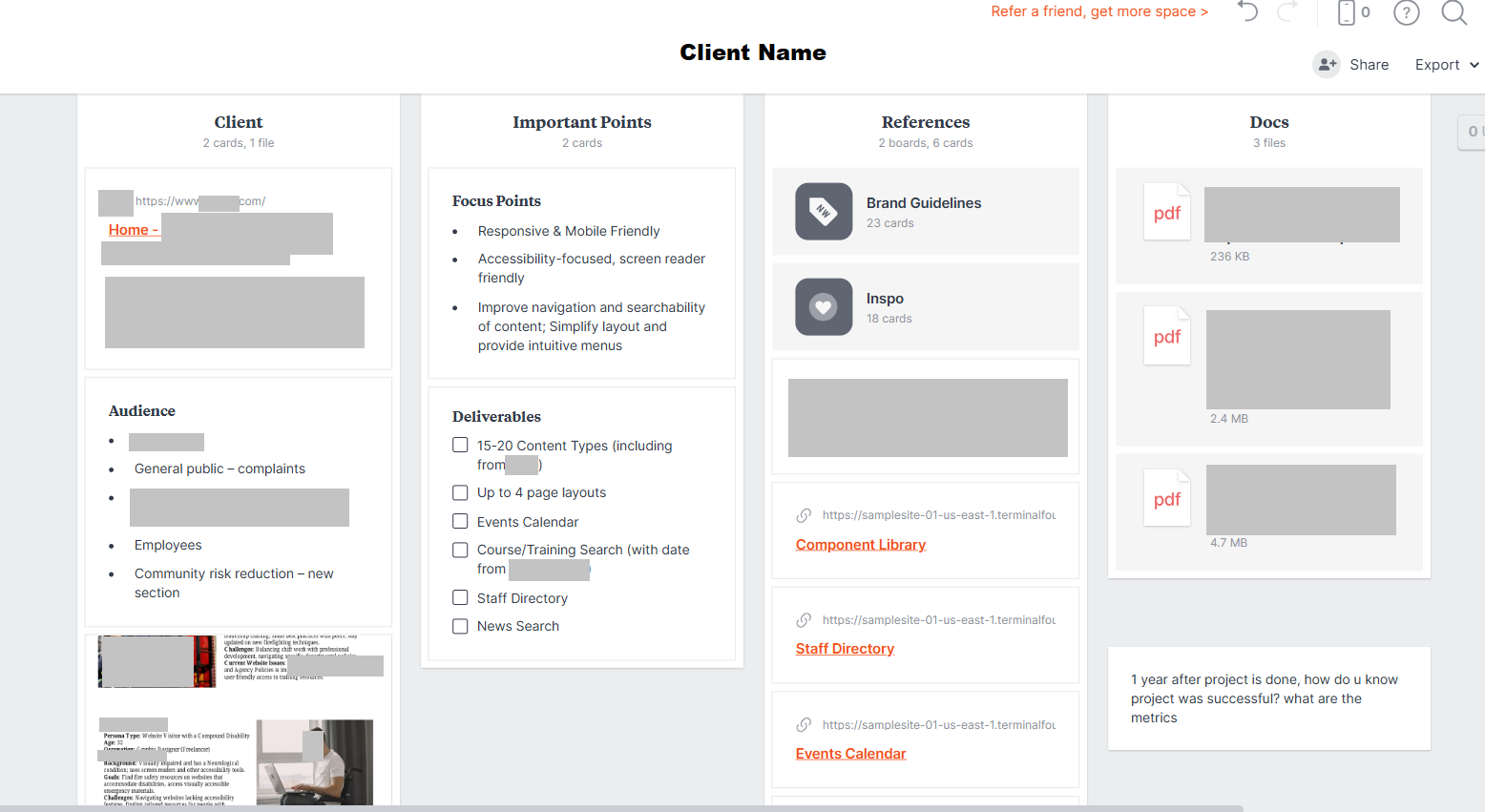
The research phase included a 127-response user survey, a full content audit using Screaming Frog, analytics review via the SiteImprove dashboard, and six discovery and alignment workshops with the client. That last point turned out to be especially valuable — the early moodboard and brainstorming sessions we ran together saved weeks of design revisions later. For an opinionated client with a clear creative vision, involving them early meant fewer surprises at the design stage.
The survey surfaced four recurring pain points:
- Training classes were hard to find
- The login to the learning platform was difficult to locate
- Forms were hard to find, and when found, were often outdated
- The site felt generic and didn't reflect the agency's identity
Beyond navigation, the audit revealed that 100% of two critical internal processes still ran on paper — forms, checks, phone calls, and emails. Mobile usability was essentially non-existent, with no responsive design and a search function that rarely returned useful results.
Audiences: Initial assumptions suggested a broad user base, but the research narrowed it to three primary audiences — active fire service professionals looking for permits, professionals seeking training, and individuals aspiring to become firefighters. The client also provided eight detailed personas covering edge cases including a visitor with compound disability, a fire safety educator, a fire chief, and a new state employee — all of which shaped accessibility and navigation decisions throughout the project.
Design Process
After wireframes were approved in Balsamiq, I moved into visual design.
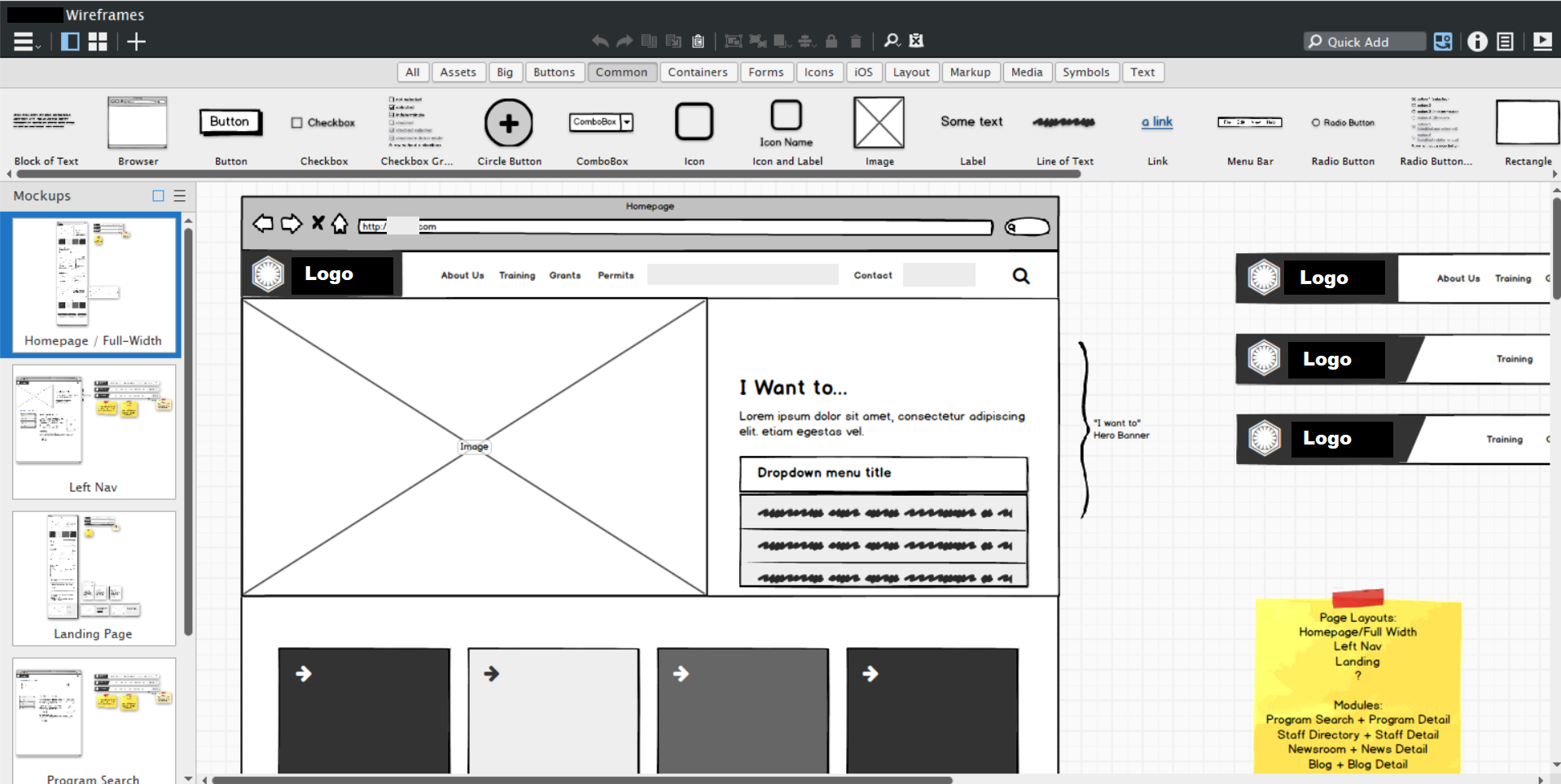
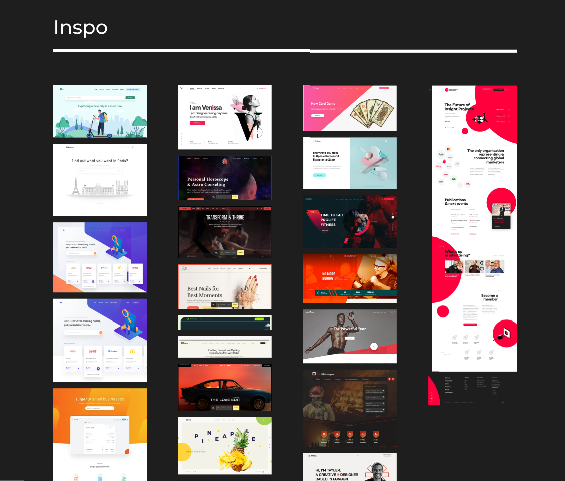
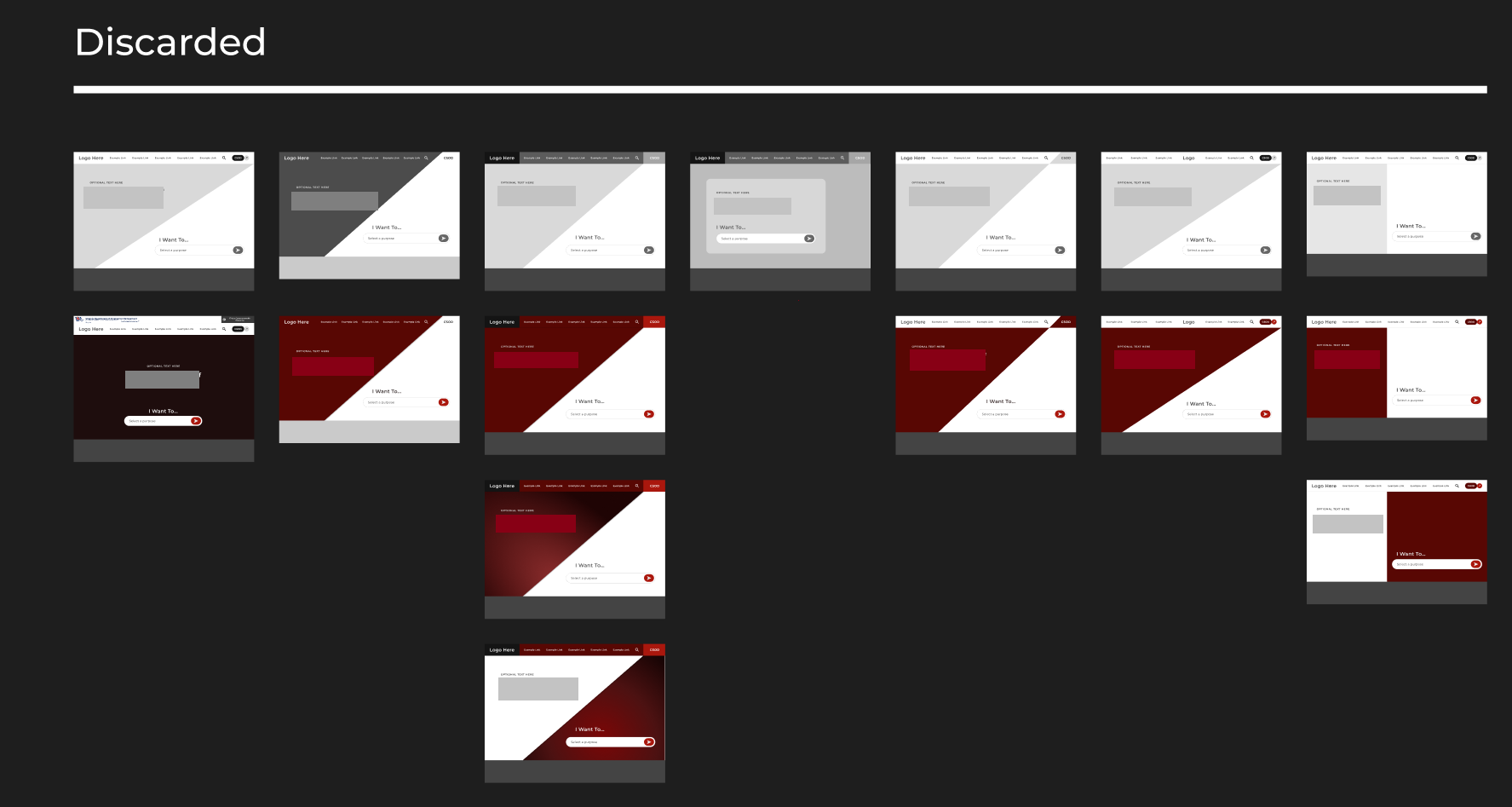
Rather than jumping straight to high-fidelity mockups, I presented a structured moodboard to the client — divided into sections covering search bar styles, navigation patterns, layout options, and color accents — alongside multiple design directions to orient their feedback.
This approach doesn't work for every client. Too many choices can overwhelm stakeholders who just want a clear recommendation. But I could tell early on that this client wanted to be involved — they had opinions and would use the creative space productively. Giving them range meant they could point to what resonated rather than trying to articulate a vision from scratch. It paid off: their feedback was specific and actionable throughout.
One technique that consistently accelerated the process was working live during calls — making simple changes directly in Figma while screen-sharing. When a client flags something in the moment, acting on it immediately lets them see the result while their attention is still on that detail. It's far more efficient than logging the request, implementing it later, and reconnecting hours later over email. This client specifically commented on how much they appreciated it.
Key design decisions that came out of this process:
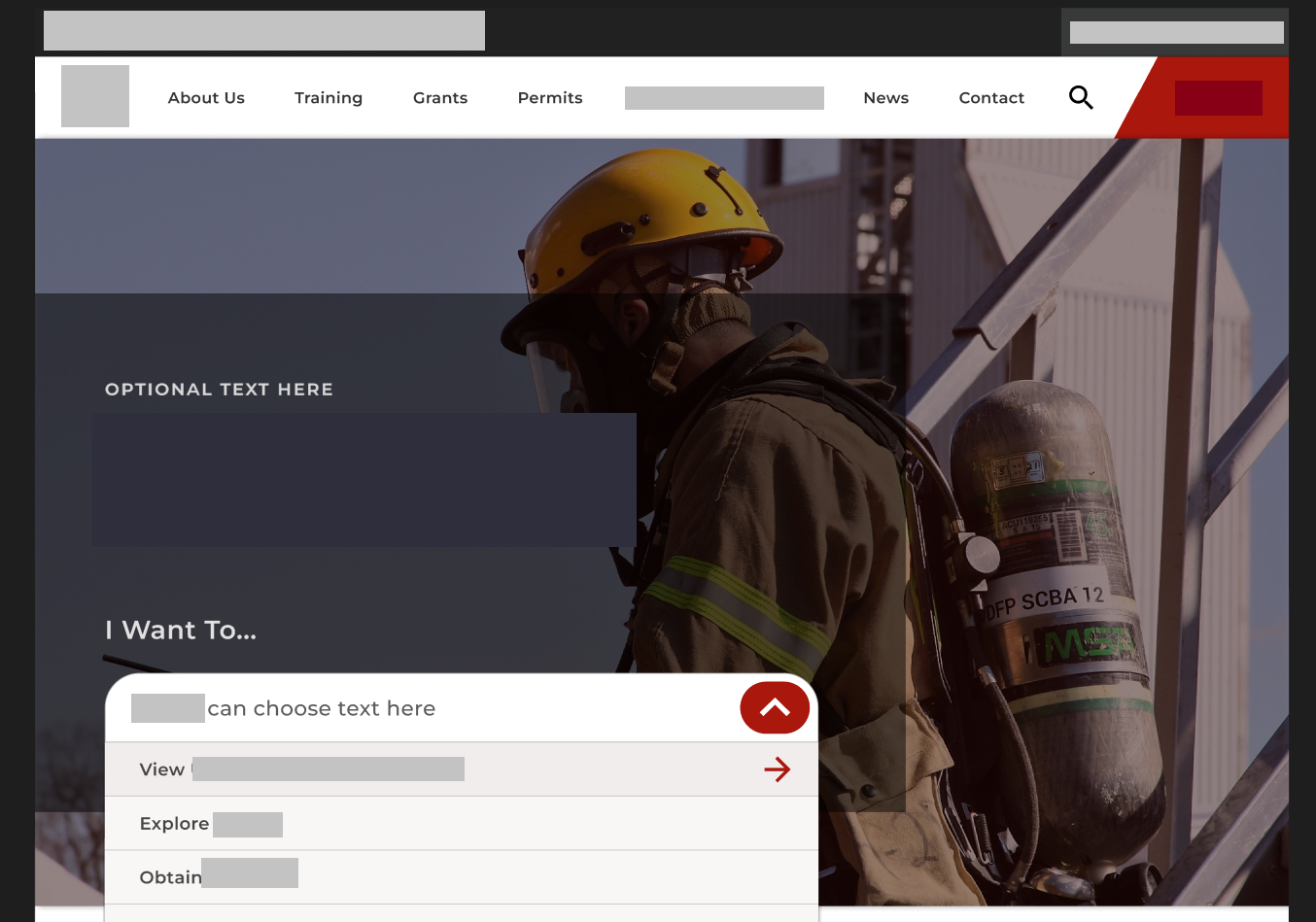
- Top-level navigation reduced from 9 items to 5, with a persistent search bar and prominent quick-links for the most common tasks
- A platform login link made permanently visible and accessible
- Card-based content layout to create logical grouping across page types
- Real action photography, chosen together with stakeholders, to make the site feel relevant to active first responders
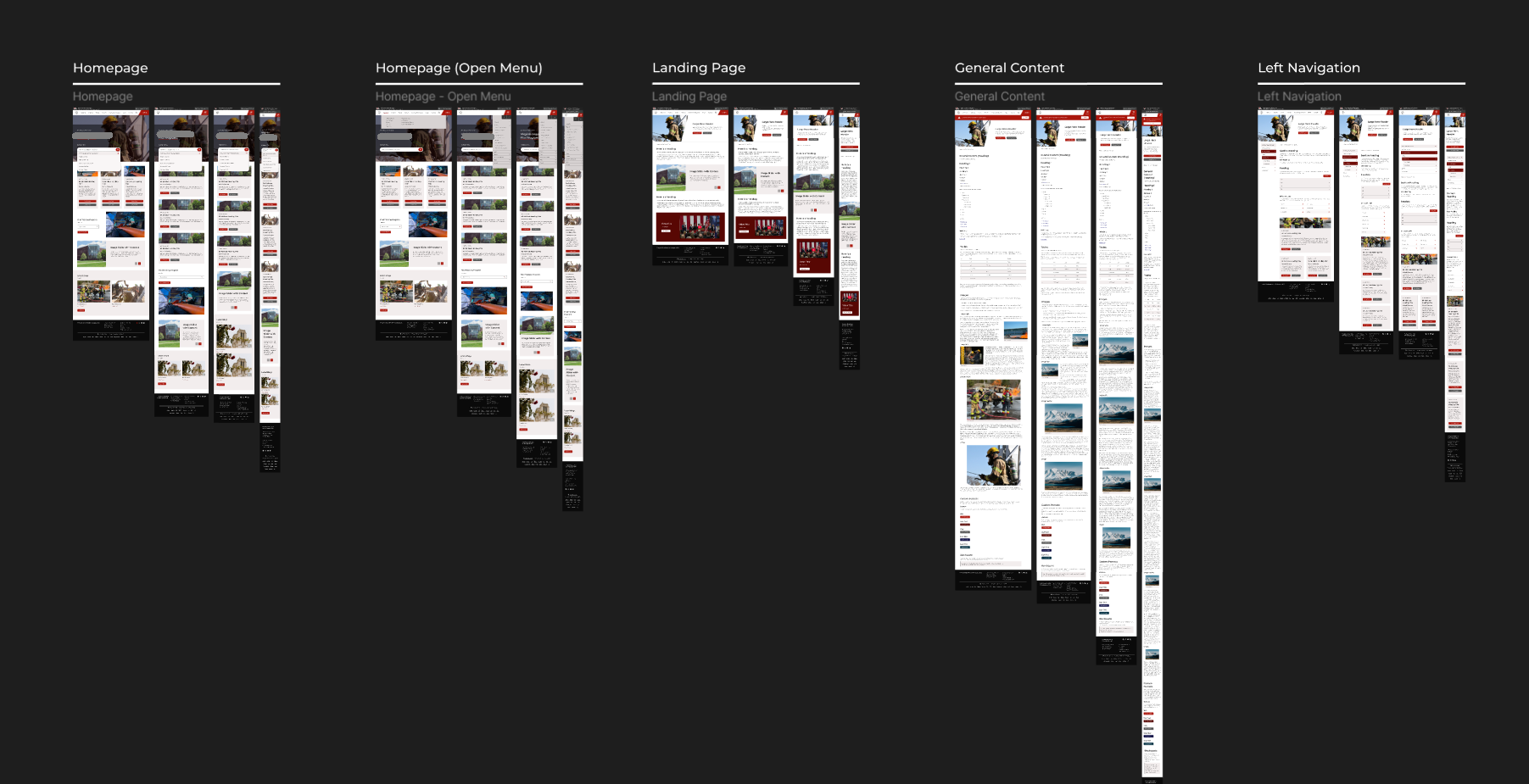
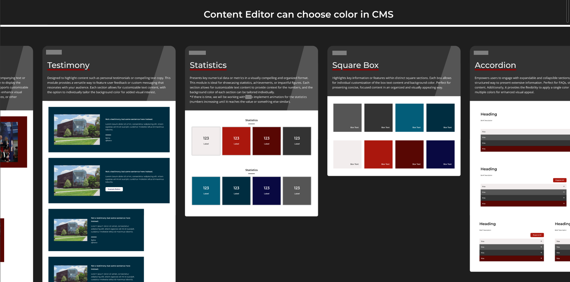
- An 8-point grid and reusable component system to ensure consistency across all content types
- Typography and color system guided by and approved by the client
- Government links bar included as required, with visual styling that fits naturally within the overall design
All designs were built mobile-first. The existing site required pinch-to-zoom and horizontal scrolling — both explicitly flagged in the survey — so responsive design was treated as a baseline requirement, not a nice-to-have.
Accessibility
Accessibility was a project priority from day one, driven both by the public-sector context and by the client's own user base. The personas provided by the client — particularly the visitor with compound disability — kept accessibility grounded in real use cases rather than treated as a compliance checklist. In practice, this meant color contrast testing in Figma for WCAG compliance, keyboard navigation and focus state testing throughout the design process, and cross-browser and real-device testing before sign-off.
Digital Applications
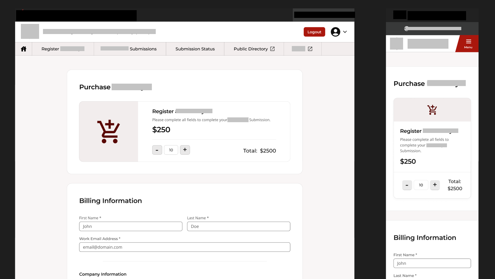
Beyond the website, two paper-based processes were fully digitized as part of the same engagement:
A secure manufacturer portal allowing vendors to self-register, upload files, and process payments — with an internal approval workflow between the two applications.
A public digital permitting application designed with less tech-savvy users in mind, handling form submission, file uploads, and payment processing.
Both were designed and built with the handoff in mind. I wrote two comprehensive documents: a client-facing style guide covering all content types and design decisions, and a developer handoff document detailing every component and its implementation. Thoroughly documenting everything turned out to be invaluable — not just for the developers, but for the agency's future content maintainers.
Outcome
Both the redesigned website and the digital applications launched successfully and on time, with all deliverables signed off after UAT. After launch, the agency reported a noticeable reduction in phone and email enquiries about where to find things — a direct signal that the navigation improvements were working. The two paper processes were fully replaced by digital forms.
Reflections
The moodboard session early in the process was one of the best decisions on this project. For a client this engaged, it compressed weeks of potential back-and-forth into a single focused conversation.
Building part of the frontend myself gave me a much clearer understanding of production constraints, which made the design-to-handoff transition smoother than it might otherwise have been.
The one thing I'd do differently: I would have pushed for one or two rounds of independent testing with actual end users before final approval. All iterations were validated through client feedback, which worked well — but real user testing would have added a layer of confidence, particularly for the applications. Government timelines and dependencies made this difficult to schedule, but it's something I'd advocate for earlier in future projects.