Contributing to an existing design system
This client had a well-defined Figma file with established styles and components. My role was to design new page templates that felt native to their existing system — reusing components wherever possible to reduce development time, and only creating new ones where the content genuinely required it.
Designing for different content types
The client needed four distinct resource page types, each serving a different purpose and user need. Rather than applying a one-size-fits-all layout, I designed each with its specific context in mind:
- Audio page layout needed to support embeds from multiple platforms (Buzzsprout, Spotify, and others), so I ensured all embed formats were accounted for and rendered consistently within the layout.
- Video page layout was designed to pair a YouTube embed with supporting text, giving editors space to add context alongside the content.
- Link post page layout was built for sharing external references — a clean, focused layout for a link and the author's commentary around it.
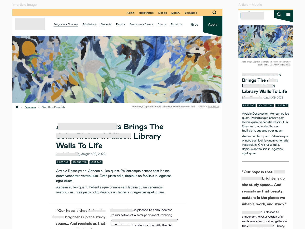
- Article page layout followed a long-form reading layout, with a rich HTML editor area supporting headings, paragraphs, images, pull quotes, and links.
Despite these differences, all four page types share a consistent header structure — title, date, and categories always appear in the same position — giving the resource section a coherent feel regardless of content type. Every page also ends with a Related Resources row, surfacing two relevant cards to encourage further exploration.
Process and collaboration
The early stages of the project had some turbulence due to conflicting feedback from the client's team. Once that was resolved, the collaboration became smooth and productive, and after multiple rounds of feedback the client was very happy with the results.
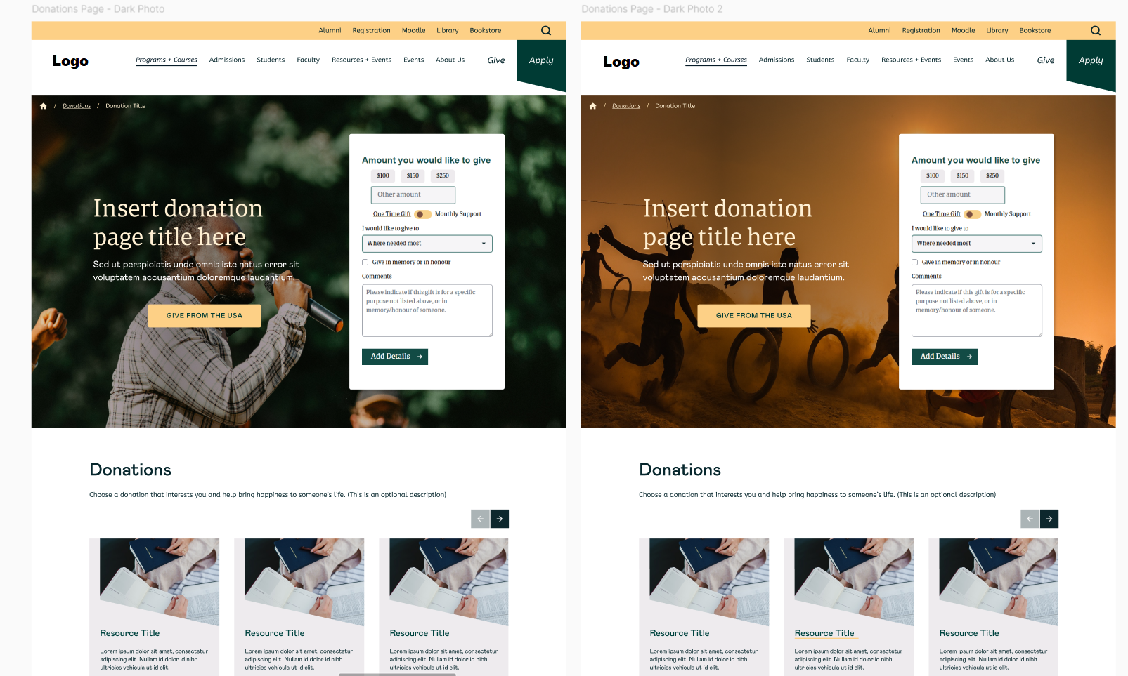
Donations Page
Months later, the same client returned for a smaller follow-on project: a donations page that would embed their existing third-party form. The brief was to make the page feel considered and on-brand while keeping development costs low.
My approach was to reuse an existing card slider component for the surrounding content, and design a custom hero banner to frame the form embed. I also provided recommendations on the form's field structure and order to improve usability before users even reached the submit button — stepping slightly beyond the design brief to flag something that would affect the experience.