Students Portal
This client was already hosted on the T4 CMS, and wanted to create a new microsite for a students portal. Their goal was for everything to be similar, except for the homepage banner, so students knew they weren’t on the main website anymore. They also wanted a new main color that wasn’t blue, to help students distinguish both.
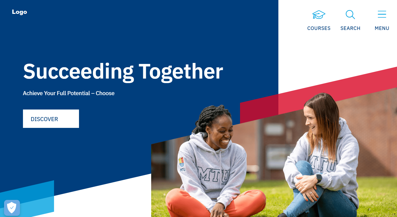
This isn’t uncommon to happen, but these clients weren’t very sure about what they wanted. They brainstormed a lot between themselves in our design calls and didn’t remember decisions they had previously made. Because of that, I found it more challenging to understand what they wanted at first, but I always tried to ask questions and especially listen, and that strategy led me to success as always!
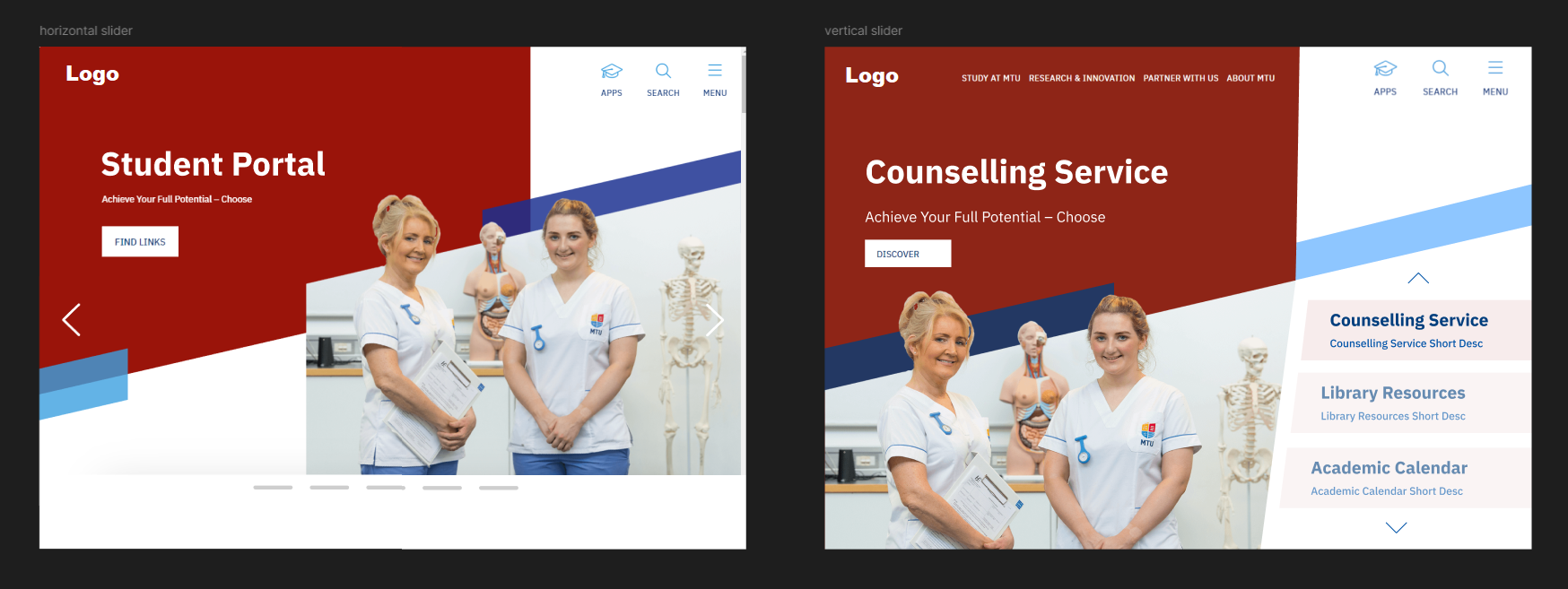
When I presented the first designs, I realised the clients wanted something even more different than the main website’s homepage, so we brainstormed a little more, and they liked my next iteration.
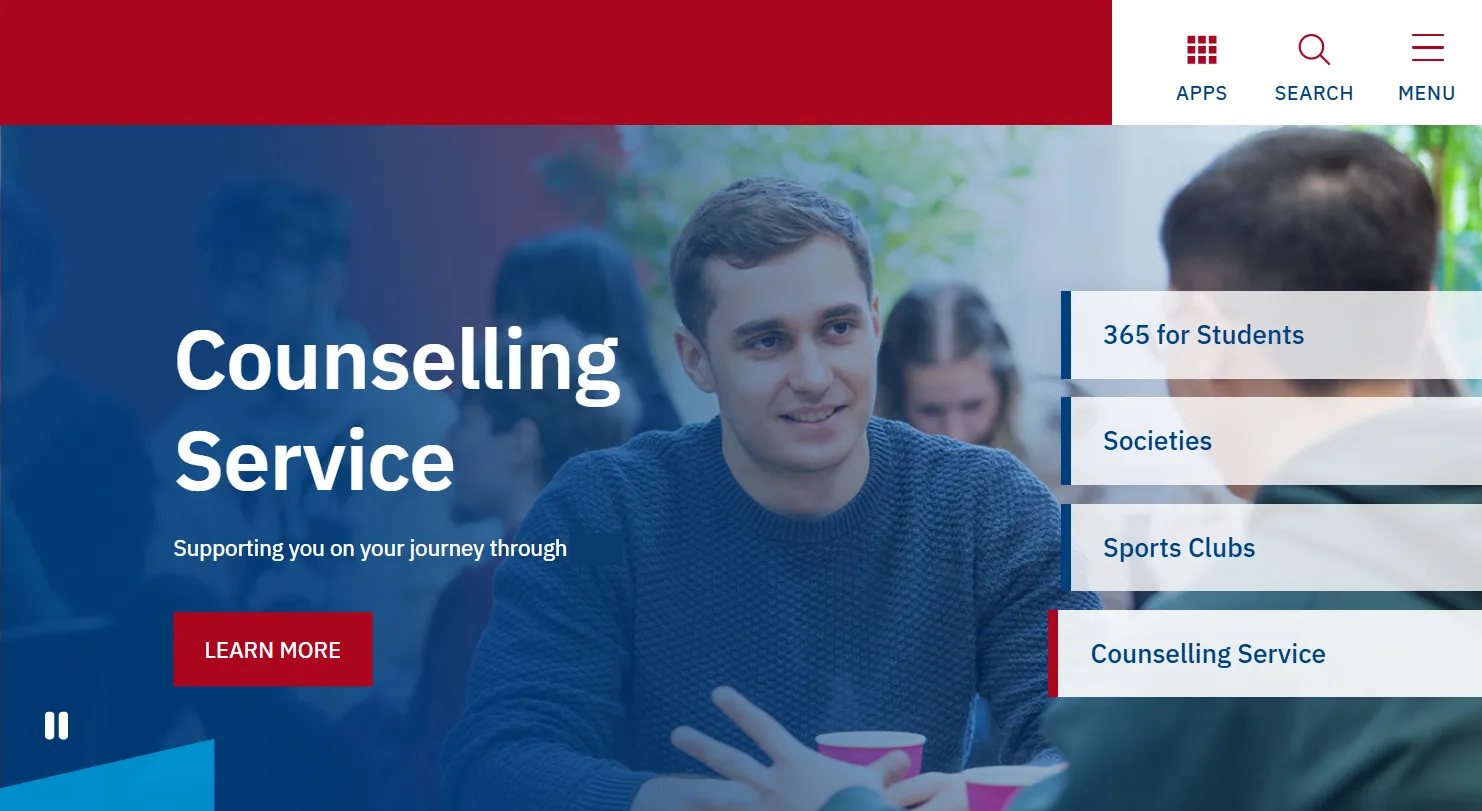
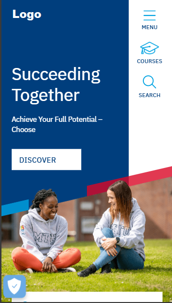
They also wanted a new layout for the top menu, so I suggested a horizontal layout instead of vertical for the icons, and they really liked it!
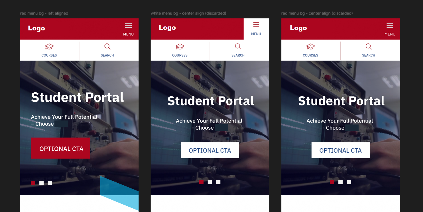
I gave them multiple options for the mobile layout, and they chose the first one in the image below.
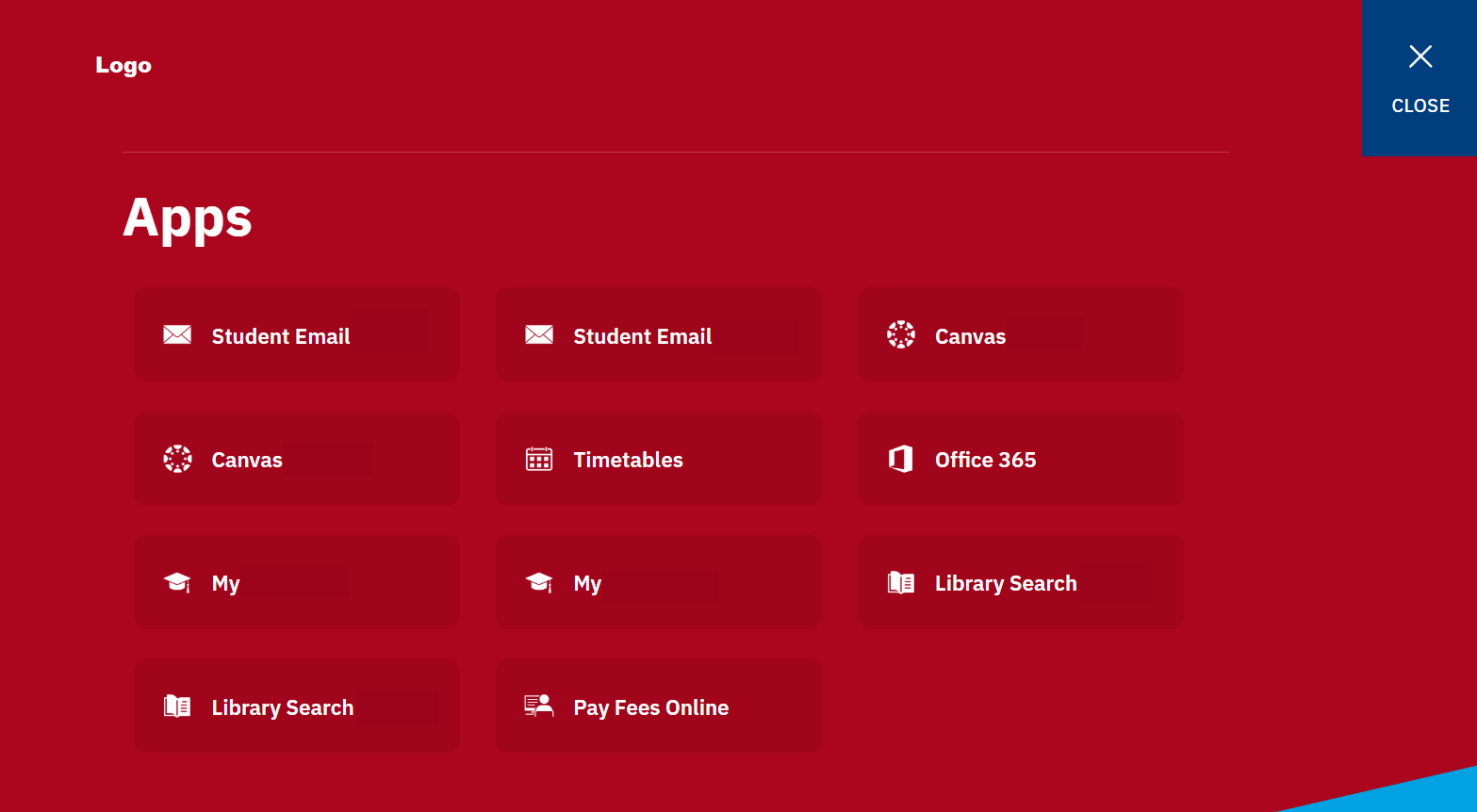
Besides the homepage banner, they also wanted a new menu from scratch, that matched their other menus, and that allowed to add multiple links that were relevant for students. This was my suggestion and they liked it as well so we went with it. Each rectangle is a link to a relevant section of the students portal.
